MyAryaka Navigation Redesign
Solving critical usability issues in enterprise network management through intelligent information architecture and persistent navigation context
The Problem
Network administrators were struggling with a navigation system that constantly lost context across all tasks — whether configuring settings, monitoring network status, troubleshooting issues, or managing resources — making routine workflows frustrating and time-consuming.
Context Loss on Navigation
When users navigated between top-level tabs (Home, Monitor, Config, Status, Reports), the left sidebar completely refreshed, losing their previous location. If a user was configuring Security settings and switched to Monitor to check status, returning to Config meant starting navigation from scratch.
"I constantly lose my place when switching between Config and Monitor. It's like the system has amnesia - I have to click through 3-4 levels every time I come back."
Difficult Cross-Section Navigation
Switching between related features like SD-WAN and Security required going back to the top level, selecting a different tab, and re-navigating through the sidebar. This broke the user's mental model and workflow, especially when configuring interconnected features.
"When I'm setting up a new site, I need to configure SD-WAN, then Security, then check the Status. But each time I switch, I lose context. It feels like I'm fighting the interface."
Deep, Confusing Hierarchy
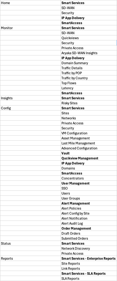
The navigation had too many levels: top tabs → left sidebar sections → subsections. Users struggled to understand where they were in the hierarchy and how to get to related features. The same feature (like "Smart Services") appeared under multiple tabs, creating confusion.
In usability testing, 8 out of 10 users couldn't explain the difference between "Smart Services" under Home vs. Config vs. Monitor. The redundant structure created cognitive overhead.
No Persistent Context
The left sidebar completely changed based on the top tab selected, making it impossible to quickly jump between related features in different sections. Users couldn't maintain a mental map of the system because the navigation was constantly changing.
"I feel like I'm navigating a different application every time I click a top tab. There's no consistency, no way to quickly jump to what I need."
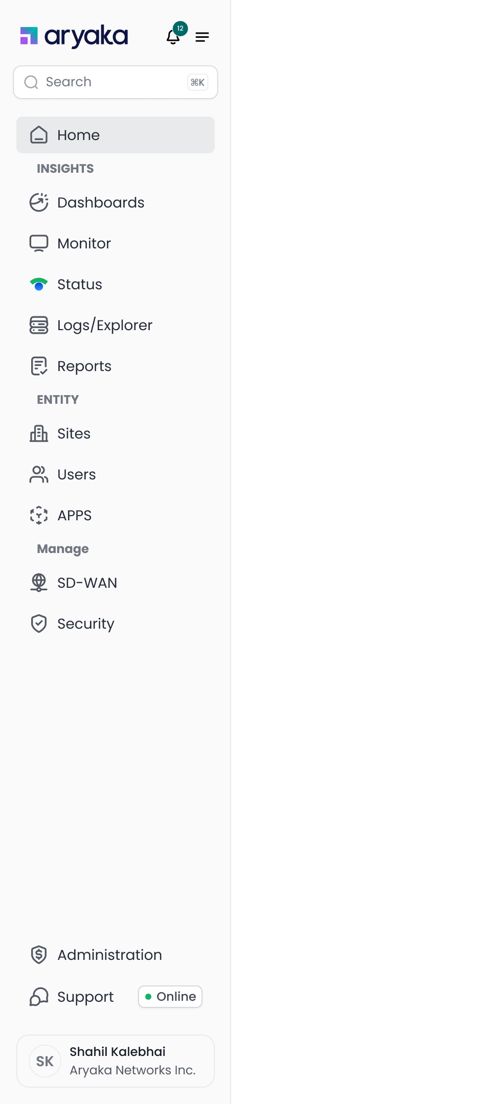
The Old Navigation Structure
The sitemap below shows the complex, multi-level hierarchy that users had to navigate. Notice how features are scattered across different top-level tabs with no clear relationship or persistent context.
The Impact on Users
These navigation issues weren't just annoying - they had measurable impacts on productivity and user satisfaction.
Design Goals
Based on our research and tree testing results, we established clear goals for the navigation redesign.
Maintain Context Across Navigation
Users should never lose their place when switching between different areas of the application. The navigation should remember where they were and provide quick ways to return.
Enable Quick Cross-Section Access
Make it easy to jump between related features (like SD-WAN and Security) without losing context or requiring multiple clicks through the hierarchy.
Simplify Information Architecture
Reduce the navigation hierarchy from 3+ levels to a flatter, more intuitive structure that matches users' mental models and task flows.
Improve Feature Discoverability
Make it obvious where features live and eliminate redundant labels. Users should be able to find what they need without trial and error.
The Final Solution
After multiple rounds of testing and iteration, we arrived at a navigation structure that solves all the key problems: persistent context, clear grouping by user intent, and seamless cross-section navigation.
The New Navigation System
The new navigation features a persistent left sidebar with clear intent-based grouping: Observe (Dashboards, Monitor, Status, Logs/Explorer, Reports), Entity (Sites, Users, APPS), and Manage (SD-WAN, Security). This structure eliminates context loss and makes it easy to jump between related features.
Manage Section Expanded
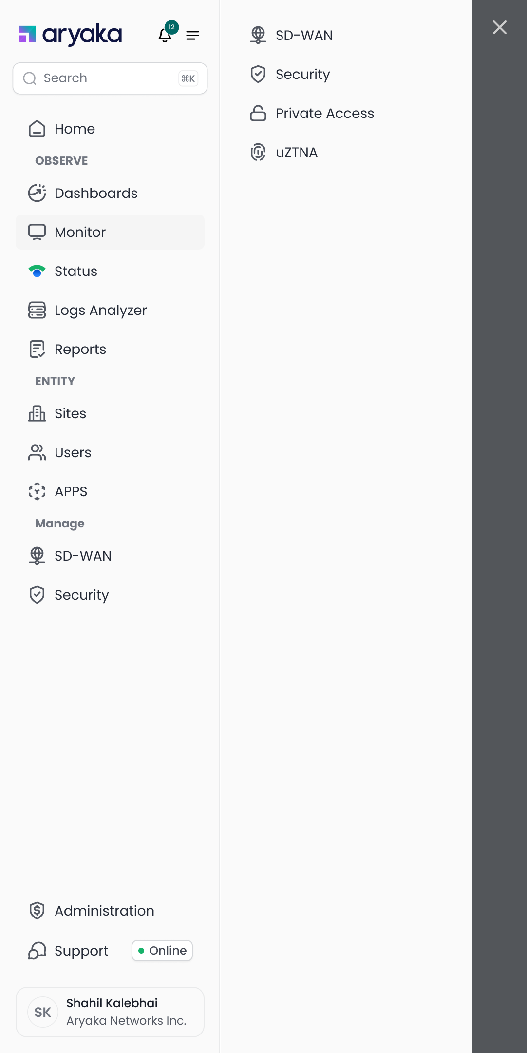
Clicking SD-WAN or Security opens a right panel with related features, maintaining context in the left sidebar
Security Features Panel
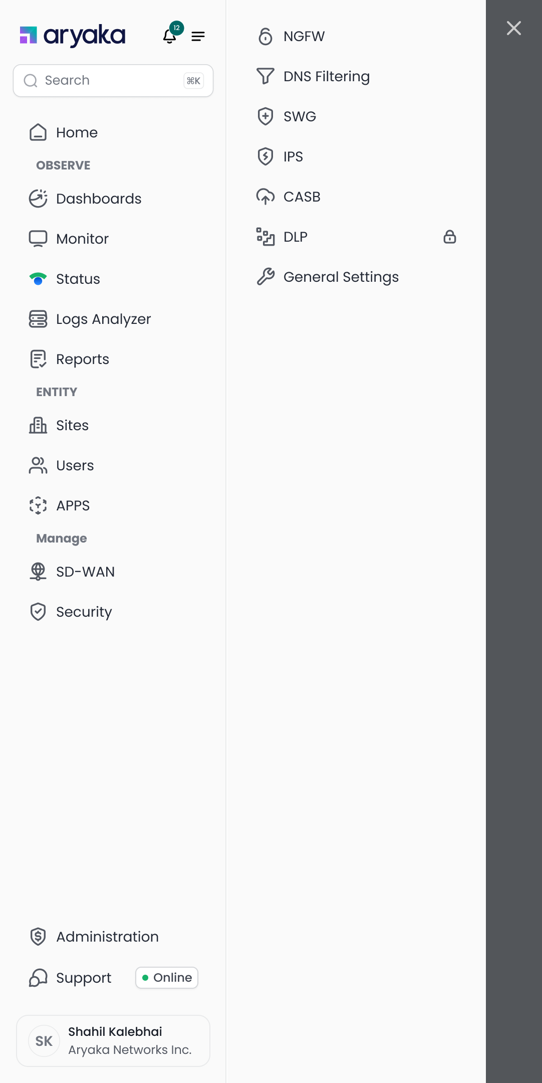
Security features (NGFW, DNS Filtering, SWG, IPS, CASB, DLP) are organized in a contextual panel
Key Features of the New Navigation
Persistent Left Sidebar
The left sidebar never changes, eliminating context loss. Users always know where they are and can quickly navigate to any section without losing their place.
Intent-Based Grouping
Features are organized by user intent: Observe (monitoring and reporting), Entity (managing resources), and Manage (configuration). This matches how users think about their tasks.
Contextual Right Panel
Clicking on SD-WAN or Security opens a right panel with related features, keeping the left sidebar stable. Users can quickly switch between related features without losing context.
Flatter Hierarchy
We reduced the navigation from 3+ levels to just 2 levels in most cases, making it faster to reach any feature. The average number of clicks to complete a task dropped from 5.2 to 2.1.
Clear Visual Hierarchy
Section headers (INSIGHTS, ENTITY, Manage) use different visual treatments to create clear boundaries. Icons and consistent spacing make it easy to scan and find features quickly.
Impact & Results
The new navigation system delivered significant improvements across all key metrics, validating our research-driven approach and user-centered design process.
User Feedback
"Finally! I can switch between monitoring and configuration without losing my place. This is a game-changer for my daily workflow."
"The new navigation makes so much more sense. I can find everything I need without clicking through multiple levels. It's intuitive and fast."
Key Learnings
Data-Driven Decisions
Combining analytics data with tree testing provided objective validation for our design decisions. We could confidently prioritize features and validate information architecture choices.
Iterative Testing is Essential
Running multiple rounds of tree tests helped us identify and fix issues early. Each iteration brought us closer to an optimal solution that users could navigate intuitively.
Context is King
The single biggest improvement came from maintaining persistent context. Users need to feel oriented and in control, not lost in a constantly changing interface.