Reimagining the Home Page
Transforming a network-only status page into a unified SASE dashboard that serves as the strategic command center for CIOs, CISOs, and IT Directors.
The Challenge
What We Discovered
- •The Status page was the most visited page, despite not being designed as a landing page
- •The existing home page showed random charts with only network-based metrics
- •Security features (SASE) were buried and not integrated with network data
- •Executive users couldn't get a unified view of their network and security posture
The Opportunity
User interviews with top customers revealed they were visiting the Status page to quickly assess operational health before diving into specific modules.
This insight led us to reimagine the home page as a strategic command center that brings together SD-WAN and Security (SASE) in one unified view.
Target Personas
We designed the home page to serve three key decision-maker personas, each with distinct needs and priorities.
Chandra
Needs a high-level summary of network status to feel confident the network posture is healthy.
Sherri
Wants to immediately spot critical incidents or increasing threat patterns for quick mitigation.
Ian
Requires real-time operational visibility into network, application usage, and user behavior.
Design Goals
Our vision was to create a home page that emphasizes the power of integrated networking and security capabilities.
Unified SASE View
Bring together SD-WAN and Security in one cohesive dashboard, showing the complete picture of network and security posture.
Executive-First Design
Prioritize high-level summaries and health indicators for decision makers, while allowing operators to drill down into details.
Real-Time Visibility
Surface critical alerts and status changes immediately, with auto-scrolling feeds and live indicators.
Interactive Exploration
Enable users to interact with the network topology map, zoom into sites, and navigate to detailed views with a single click.
Designing for Complexity & Scale
The real challenge wasn't just designing one home page—it was designing a system that adapts to dozens of feature combinations and scales from small businesses to global enterprises.
Multiple Feature Combinations
Every customer has a unique configuration based on their purchased features. We had to design screens for all possible combinations:
- ✓New UsersFirst-time login with no data
- ✓All Features EnabledFull SASE suite with SD-WAN + Security
- ✓No Remote Users + SecuritySD-WAN with security, no remote access
- ✓No Security + Remote UsersSD-WAN with remote access, no security
- ✓No Security + No Remote UsersSD-WAN only, basic networking
.png)
Designing for Different Customer Scales
Our customer base ranges from small businesses with 3-5 sites to global enterprises with 500+ locations. The interface needed to remain clear and performant across this entire spectrum.
Adaptive Interface Design

Components dynamically show/hide based on enabled features. If security isn't purchased, the Threats panel is replaced with an upsell card.
The network topology map uses progressive disclosure—showing summary views for large networks and detailed views for smaller deployments.
For enterprise customers with 500+ sites, we implemented virtualized rendering and lazy loading to maintain 60fps interactions.
Every component has a thoughtful empty state that guides users on next steps, whether it's waiting for data or enabling a feature.
The Result: A Flexible Design System
By designing for these edge cases upfront, we created a component library that could handle any customer configuration. This systematic approach reduced development time by 40% and ensured consistent experiences across all feature combinations.
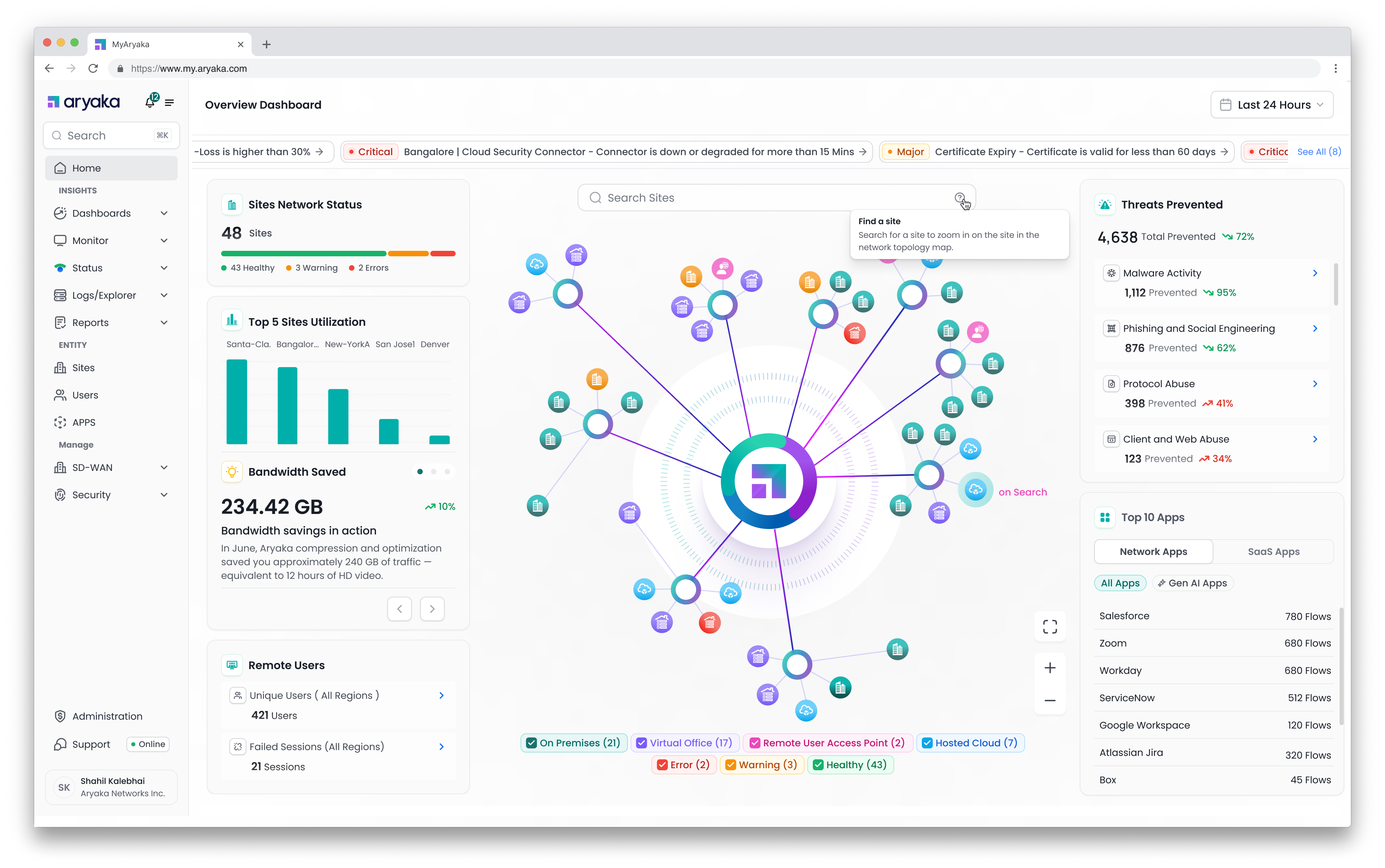
The Solution
A reimagined home page that serves as the strategic command center for unified SASE management.
Key Features & UX Elements
Live Alerts Feed
Auto-scrolling carousel displaying up to 5 most recent Critical/Major alerts
- →Auto-cycles every 2-3 seconds, pauses on hover
- →Click to navigate to active alerts page
- →Shows "No critical alerts" in green when system is healthy
Network Status Summary Cards
Four key metrics providing instant operational visibility
Interactive Network Topology Map
Visual representation of entire network infrastructure with real-time status
- →Visualizes POPs, Virtual Offices, On-Prem, Cloud, Remote Access
- →Color-coded status indicators (Healthy, Warning, Error)
- →Zoom, pan, search controls for quick navigation
- →Hover shows summary, click navigates to detailed page
Threat Prevention Summary
Real-time security threat detection and prevention metrics
- →Total threats prevented with 72% increase indicator
- →Breakdown by category: Malware (95%), Phishing (62%), Protocol Abuse (41%), Web Abuse (34%)
- →Click to drill down into security details
Top Applications Usage
Application visibility with sanctioned vs unsanctioned breakdown
- →Toggle between Network Apps and SaaS Apps
- →Shows flow counts for top 10 applications
- →CASB integration for sanctioned/unsanctioned classification
User Journeys
We designed three distinct experiences to meet users where they are in their SASE adoption journey.
SD-WAN Only Customer
Upsell opportunity through contextual education
Customer has deployed SD-WAN across hundreds of sites but lacks integrated threat protection, firewall analytics, or granular access control.
Show a persistent right-side card: "Security Insights Not Enabled"
- •Brief explanation of security value proposition
- •Action buttons: "Remind Me Later", "Contact Sales", "Don't Show Again"
- •Non-blocking, contextually relevant placement
Unlock significant upsell potential while improving customer security posture
New Aryaka Customer
First-time login onboarding experience
New customer logs in for the first time with 0 sites configured, staring at a blank slate.
Empty state with encouraging guidance
- •Headline: "Let's get your network online!"
- •Subtext: "Once you add your first site, you'll unlock insights across your network"
- •Primary CTA: "+ Add New Site" button leading to streamlined wizard
Reduce time-to-value and form positive first impression of platform ease-of-use
Day 1 - Waiting for Data
Transient state during data ingestion
Customer has configured ≥1 site but no traffic data received yet to populate dashboard.
Reassuring transient state with next steps
- •Headline: "Waiting for Traffic Data"
- •Subtext: "We're listening for data. Once it flows, you'll see your dashboard"
- •Primary CTA: "Manage Sites" to check configurations
- •Secondary CTA: "+ Add New Site" to continue expansion
Reduce anxiety during waiting period and encourage continued configuration
Success Metrics & Impact
How we measure the success of the redesigned home page.
Primary Metrics
- Daily Active UsageTrack daily visits to Overview page, trending upward
- Executive EngagementQualitative feedback from CIO/CISO stakeholders (net positive sentiment)
- Time to InsightReduce time from login to identifying critical issues
Secondary Metrics
- 📈Security Feature AdoptionIncrease in customers enabling security modules after seeing upsell prompts
- ⏱️Session DurationAverage time spent on home page (currently 22.3 minutes)
- 🎯Click-Through RatePercentage of users clicking from home page to detailed views
Current Usage Statistics
The Data Behind Our Decision
Analytics from the old platform revealed critical insights that shaped our redesign strategy.
Key Discovery
Despite not being designed as a landing page, the Status page was the most visited page in MyAryaka, indicating users were seeking a quick operational overview before diving into specific modules.
Page Visit Distribution
Insight: Status page received nearly 40% of all traffic, despite being a simple status checker.
Monthly Active Users Trend
Growth: 89% increase in active users over 6 months, indicating strong platform adoption.
Average Session Duration by Page
Insight: Users spent the most time on the Status page (22.3 min avg), confirming it as the primary operational hub.